
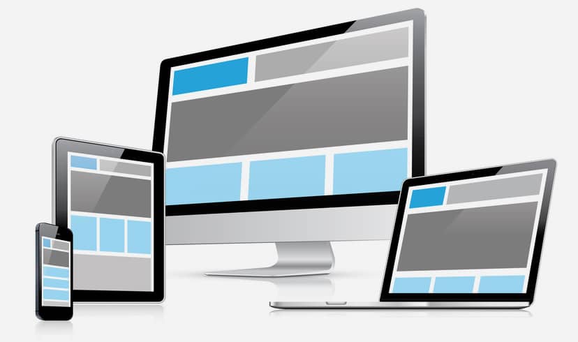
Responsive Design is the approach in design where main focus of design and development is to make website respond to the device size that user is using. In contradiction to mobile website design and development, responsive design focuses on targeting all devices. This is achieved via writing media queries, fluid layouts targeting various break points.
Media Queries
Media queries are the CSS3 features that include features like detecting width [max width and min width], device width, orientation etc. Most of the mobile devices and mobile phones detect these new features, and this is where media queries come handy.
By using the minimum and maximum device with property we can target devices within certain dimensions. For example, in order to target devices between 320px and 480px we can target it using media queries as:
[php]
@media screen and (min-width: 320px) and (max-width: 480px) {
//css goes here
}
[/php]
A series of media queries are written to target different devices as needed.
Media Queries and Breakpoints
As stated above we can use media queries target certain device sizes, orientation etc.
Breakpoints refer to the list of device size that is targeted via media queries. Decision to target device sizes is to be made properly and with good research on the visitor’s statistics and analytics. Other important aspect to take in mind would be the current market share of the most popular devices.
There is no hardcore rule that less or more breakpoints works better, but overdoing by targeting many breakpoints might not be a good practice. My approach had been to use the common device size with a mix of fluid css.
Mobile First Approach
Generally, designers used to design for the desktop and then make adjustment for the mobile site based on the requirements. But with mobile first approach it’s other way around, where mobile design is done first and then gradually shifted to higher resolution devices such as tablets and desktops.
Mobile first can be a good approach considering following things:
- Growing number of people using internet from mobile devices
- The need of mobile websites to be more focused and engaging to make lasting experiences on the visitors
- Usage of Progressive Enhancement and Graceful Degradation
Summing up, Responsive web design had been a hot topic in 2013, and also has a long way. There had been huge improvements though there are still some challenges.